Credits
Leonardo Ramirez
Date
August, 2024
Role
Research, Prototype, Presentation
Tools
Figma, Figjam, Zoom

Beyond technical issues such as extended loading times and slow app performance, Goodreads distinguishes itself from competitors with its vast potential and extensive array of free features. In this redesign, we prioritized resolving key user pain points to create a more seamless and responsive experience that directly addresses their main concerns.
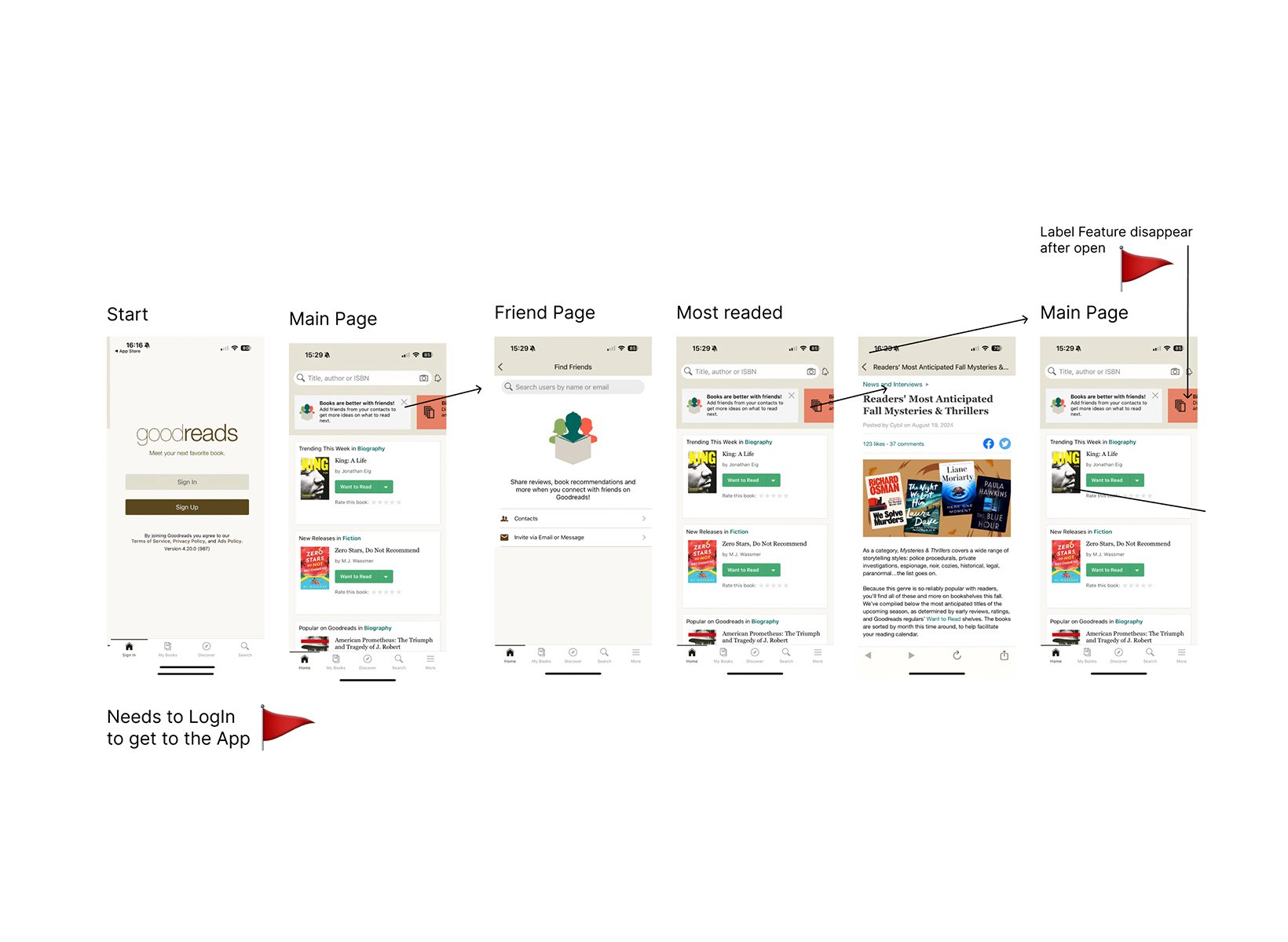
Heuristic Analysis: I use the Nielsen’s design principles provide a solid foundation for product testing. While it’s possible to apply all ten principles, beginners might find focusing on a few less overwhelming. To start, select a few key guidelines and conduct an analysis based on those, as I did in this evaluation.
Effort measures the resources required to build a feature. It helps us identify which features will be easier to implement.
I developed a feature prioritization guide using an effort-impact matrix, focusing on areas that deliver the most value to users. Key high-value priorities identified include enhancing user reviews, optimizing layout alignment, adding new accordion-style information sections, and improving the sharing functionality. These features were selected based on user feedback and are expected to provide substantial improvements in user experience and engagement.
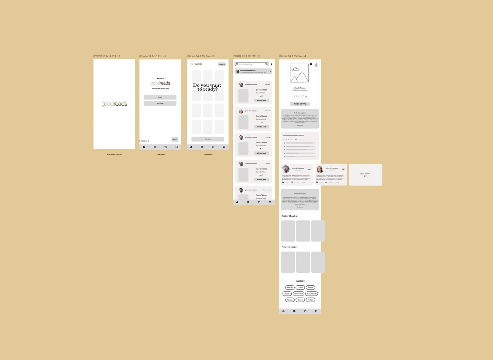
I created a visual framework for the digital interface, capturing the primary structure, layout, and core functionality. This outline focuses on the main features, allowing me to establish a clear visualization for my high-fidelity prototype without delving into detailed design elements just yet.
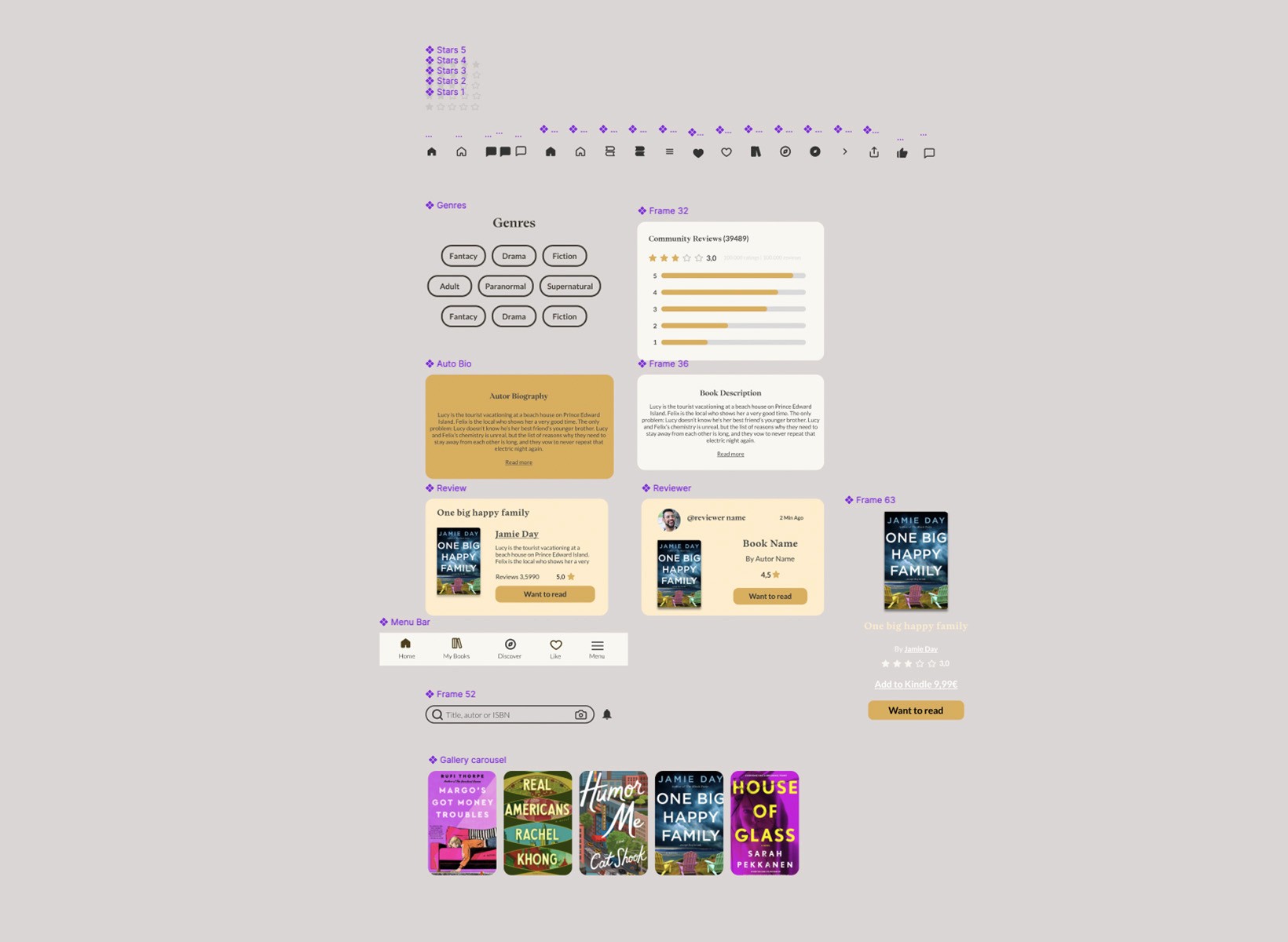
After establishing the initial visualization of the interface, I moved on to creating a detailed component library to streamline the design and development process. This library focuses on key feature components identified as high-impact, including new content categories, an interactive carousel, expandable accordion sections for information, and a redesigned user profile. Each component is crafted with a consistent style and interaction pattern, ensuring the final design maintains a cohesive and user-friendly experience.
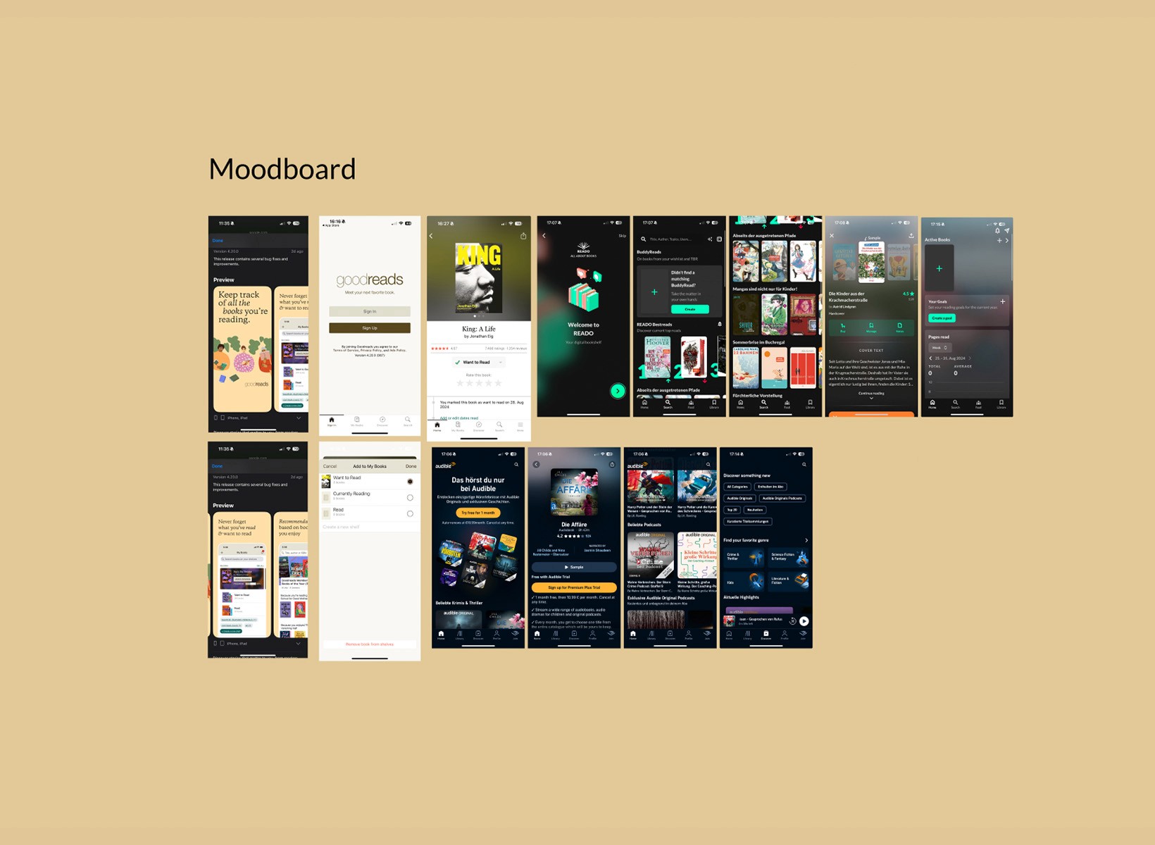
I put together a mood board showcasing competitor designs to develop a clear point of view and gather inspiration. This helped me identify effective design elements and features, guiding the creative direction for my own application.

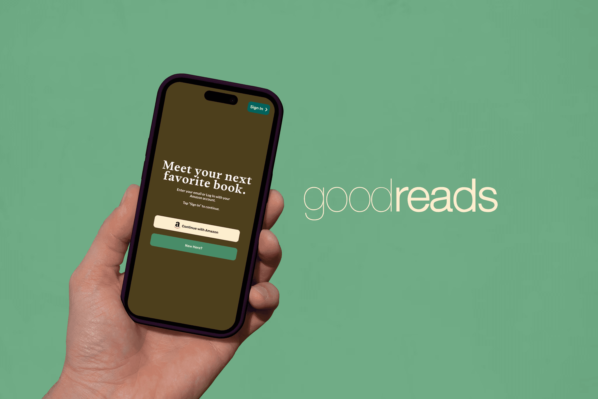
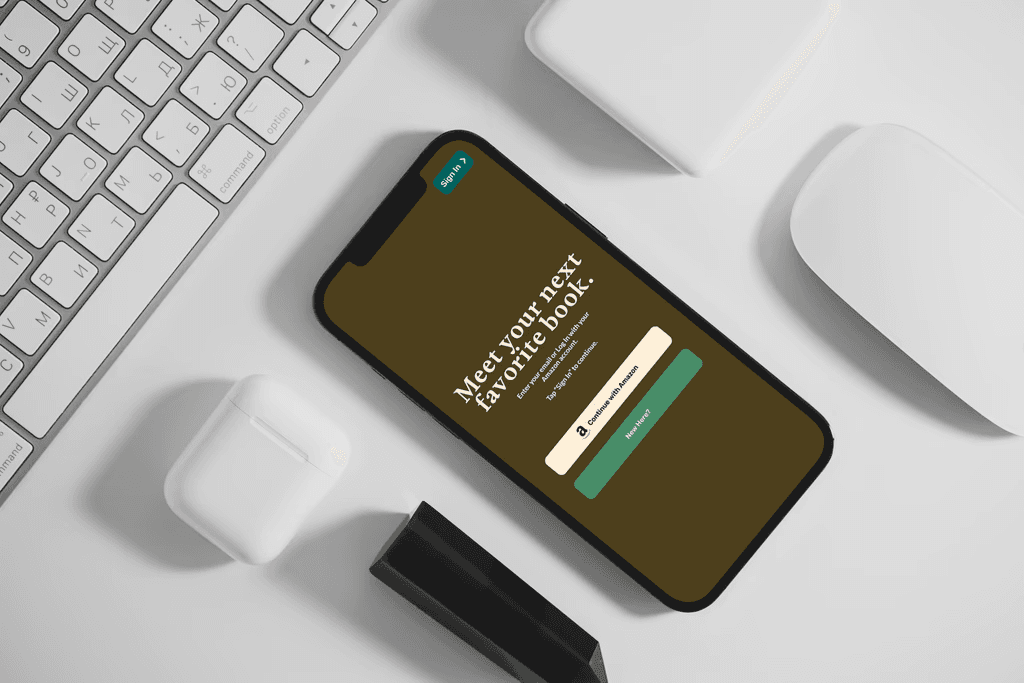
The style tile features a warm, bookish aesthetic inspired by Goodreads, using brown as the primary color for the background and typography, paired with beige for card elements to create a cozy contrast. The typography combines elegant serif fonts for headings and modern sans-serif for body text, ensuring both style and readability. Buttons are designed with multiple variants: solid, outlined, and minimalist ghost styles, offering flexibility for different actions. Subtle hover effects and rounded card corners add depth and softness, while the overall design maintains a clean and inviting literary feel.

We embraced a modern design aesthetic by using Neue Machina for display typography, adding a bold and futuristic touch, and Helvetica Neue LT for body text to ensure readability and balance. The bright color palette, featuring vibrant greens and purples, infuses the design with a sense of modernity and energy, perfectly complementing the overall visual language.
We redesigned the visual elements to create a more inviting and engaging experience, reflecting the mentor’s personality. These enhancements guided our design and development phases, ensuring that each decision was aligned with the goal of creating a more effective and user-centered platform.
My learnings
In summary, Goodreads is a valuable platform with a mission to connect people with books and reignite a love for reading—even for me. Redesigning Goodreads based on heuristic analysis highlighted the importance of aligning the platform with established usability principles. By emphasizing user control, consistency, error prevention, and aesthetic improvements, the user experience can be significantly enhanced. This project deepened my understanding of UX design, from research to testing and iteration, and reinforced the value of creating personalized content for diverse users.